Remember these are guidelines not absolute laws. They are meant to be broken at the right times. Usually when they are broken though, it is at the wrong times because people do not understand how to apply them.
Divine Proportion – that when creating a web page, the content and sidebar should have an proportion of 1.618
•calculator: http://goldenratiocalculator.com/
Example:

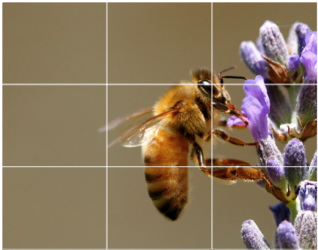
Rule of thirds – We should place objects along the lines and points along the thirds as shown in the image:
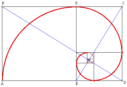
Golden rectangle – related to the divine proportion (just applying the concept) into a perfect shape. “The ratio, called the Golden Ratio, is the ratio of the length to the width of what is said to be one of the most aesthetically pleasing rectangular shapes. This rectangle, called the Golden Rectangle, appears in nature and is used by humans in both art and architecture. The Golden Ratio can be noticed in the way trees grow, in the proportions of both human and animal bodies, and in the frequency of rabbit births. “
Grids – Essentially the most basic form of design for interfaces. We layout a page in a grid. It is of extreme importance to plan out this grid before starting development so that your CSS is correct.

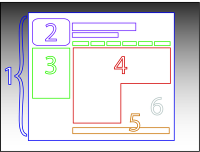
Grid Calculator: http://www.29digital.net/grid/
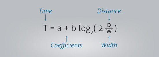
Fitt’s Law – While Fitt’s law looks confusing at first as presented in the image below it is actually quite simple. Essentially it means that the less distance between links/buttons etc that need to be pressed in order, the more usable the page is. Additionally, the bigger the buttons are, the less chance there is of user error.