Guidelines for interface design

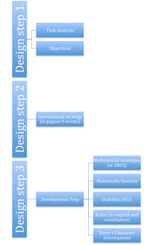
*Note 1 – these are general guidelines that need to be modified for each project and media type.
*Note 2 – –I would first consider: Users,  Context, Technology, Goals/objectives,  Task Analysis
*Note 3 – –These would be examined in order to start creating a design that is usable (usability), and then I would evaluate my prototypes using heurisitc, pluralistic, style, and cognitive walkthrough

1. –Simple and natural dialogue

1.1.     Speak the users’ language

2. –Minimize cognitive load

2.1.    Miller 1956 – 7 Concepts (+/- 2)

3. –Multimedia principles

3.1.    Images and text that explain for one another

3.2.    No extra details – only what is required; no unnecessary images

3.3.    Highlight important information

3.4.    No busy screens/backgrounds/fonts

3.5.    Fitt’s law

4. –Be consistent

5. Colors/fonts/layout – across the site/app

5.1 Colors – 2-4; fonts – legible; layout – Grid and organized

6. Follow current font, color, layout trends

7. –Provide feedback

8. Provide clearly marked exits

9. –Provide shortcuts

9.1.    Breadcrumbs

10. Deal with errors in positive and helpful manner

11. Develop for the output technology – resolution, colors, golden ratio/rectangle

12. –Rule of thirds

13. Provide help and documentation

13.1.Site map

14. –User friendly layout

14.1.Buttons/links easy to find/use

14.2.This will vary based on audience and objectives

14.3.Color, fonts, layout, sizes

Design

This is an overview of the design phase within ISD.

Step 1 –

task analysis – this is the instructional flow of content and can be a concept map (how your objectives will be accomplished). It should really be a visual of your learning objectives and help ensure that all of the content is going to be taught. This is where you will sort through content and figure out the order that it needs to be taught. What learning taxonomy are you using? You need to make sure you are using a learning taxonomy here. This document can be done in unison with your learning objectives.

Objectives – Each piece of content should be a learning objective. Each learning objective should have an assessment item. Each objective should be written in some format that includes the audience, behavior, condition, and degree. Each objective should be able to be seen in your task analysis. You must be using a learning taxonomy here. If you do NOT know what a taxonomy is I suggest using Merrill’s Component Display Theory.

Step 2 –

Instructional strategy – How will this content be taught? What instructional strategy are you using? You need to look at your objectives and task analysis and determine the best instructional strategies. These could include gagnes 9 events, problem base learning, etc. First determine if you solution is direct, indirect or experiential then figure out what strategy fits that methods. This is one of the most important parts of the ISD process. Most generic and bad training does NOT use an instructional strategy.

Step 3 – Development prep. Keep in mind that not all of these apply to all situations so take your case and see what fits (for example CBT will use the multimedia theories whereas instructor led training may not). These are done prior to storyboard development or in the beginning stages of storyboard development when working on a prototype. This step can be done consecutively with prototype development, which is the first stage of development. When developing these I am usually beginning to work on my interface which then gets put into the prototype in the development phase – this will involve the graphic designer and developers.

Motivation – Can you incorporate any motivation theories (ie ARCS model) into this instructional strategy? How?

Multimedia theories – Are we going to use the multimedia theories? This will apply to computer/technology based instruction. If so, which ones?

Usability (HCI) – Where are buttons going to be placed? Do we actually know where they should go or are you just making this up? Make sure someone is well versed on HCI (human computer interaction) before deciding this stuff. How does fitt’s law apply? The golden ratio? Grids? etc. How can I make this user friendly? Are my color choices good? A design document might be developed here to help the developer and other designers. This is really where interface design begins. The instructional designer should understand HCI if they are going to design an interface.

Rules – What are the rules for the user? What are the programming rules? This is why my instructional designer needs to understand programming. I need to be able to let the programmer know what constitutive rules are going to be applied here (this will only apply to CBT type instruction not face to face)

Story and Character Development – This only applies to CBT, certain instructional strategies, gaming, and simulations. Who are my main characters? Do they have an ARC? What is my story?  What is the scenery like? What are the graphics like? What are the sounds like?

At this point I move into prototype development. However, I place this in the development phase of ADDIE but it really happens just after design and before development. Many like to put it in the design category and that is fine, assuming its the last step.

For more on this here is an overview of the whole ISD process: https://raypastore.com/wordpress/2014/01/instructional-design-process/

design2

Basic rules of interface design for computers and mobile devices

žRemember these are guidelines not absolute laws. They are meant to be broken at the right times. Usually when they are broken though, it is at the wrong times because people do not understand how to apply them.
ž
Divine Proportion – that when creating a web page, the content and sidebar should have an proportion of 1.618

Example:
ž
Rule of thirds – We should place objects along the lines and points along the thirds as shown in the image:

ž
Golden rectangle – related to the divine proportion (just applying the concept) into a perfect shape. “The ratio, called the Golden Ratio, is the ratio of the length to the width of what is said to be one of the most aesthetically pleasing rectangular shapes. This rectangle, called the Golden Rectangle, appears in nature and is used by humans in both art and architecture. The Golden Ratio can be noticed in the way trees grow, in the proportions of both human and animal bodies, and in the frequency of rabbit births. “

ž
Grids – Essentially the most basic form of design for interfaces. We layout a page in a grid. It is of extreme importance to plan out this grid before starting development so that your CSS is correct.

Fitt’s Law – While Fitt’s law looks confusing at first as presented in the image below it is actually quite simple. Essentially it means that the less distance between links/buttons etc that need to be pressed in order, the more usable the page is. Additionally, the bigger the buttons are, the less chance there is of user error.

Design before Technology

I just saw a discussion on LinkedIn about this topic and ran into the issue during my student comprehensive exams. I will also write about it at some point but for now I have created a quick video. The main idea: You need to first look at your analysis, objectives, and instructional strategies before you choose your technology. Otherwise you might be setting yourself up for failure if the technology cannot deliver and meet your goals. Too often people ask me if they should be using Flash or Captivate or Articulate and I say: What are your objectives? What are your strategies? What does your analysis say? Is that really the best tool? Do NOT choose technology first:)